Building a SaaS product has never been easier. (or thats what my social feed keeps telling me!) But, building one that people actually sign up for is another story entirely.
To be honest, this all goes hand in hand. If it’s easier to build a SaaS product, then there’s naturally going to be a lot more competition in the market, and so your homepage is no longer just somewhere to explain what your software does. It’s your sales pitch, your first impression and, in many cases, the deciding factor in whether someone starts a free trial or heads back to Google to look at a competitor. (dont worry thats what this blog is here to help with!)
That’s why looking at companies like Notion is so valuable. They’ve invested heavily in creating a website that removes uncertainty, builds trust and makes it incredibly easy for people to take the next step. The goal isn’t to copy what they’ve already done, but take inspiration from these big enterprise-level companies who have already done all the UX and UI trials so we can get straight to making money as quickly as possibleto copy what they’ve already done, but take inspiration from these big enterprise-level companies who have already done all the UX and UI trials so we can get straight to making money as quickly as possible.
If you’re a SaaS founder wondering why your website isn’t generating as many demos or sign-ups as you’d hoped, there are plenty of lessons worth taking from one of the best examples in the industry.
It starts by showing the product, not talking about it
One of the biggest mistakes we see on SaaS websites is that they spend too long introducing themselves. The hero section is filled with ambitious claims about transforming workflows, revolutionising productivity or redefining an industry, yet visitors still don’t actually know what the product does. Notion takes the opposite approach. Almost immediately, you’re looking at the product itself. Animations bring the interface to life, workflows are demonstrated rather than described and familiar integrations appear naturally throughout the page. Within a matter of seconds, you begin to understand how the platform fits into your day-to-day work without having to read paragraphs of explanatory copy.
This isn’t just good design; it’s good psychology. Every unanswered question creates friction, and every extra second someone spends trying to understand your product is another opportunity for them to leave. Showing your software in action removes that uncertainty far more effectively than another headline ever could. That doesn’t mean every SaaS company needs beautifully animated product demos, but it does mean your homepage should answer one simple question as quickly as possible: what does this product actually help me do?
Small pieces of copy have a surprisingly big impact
When people think about conversion optimisation, they often focus on big redesigns or expensive development projects. In reality, some of the smallest pieces of text on your website can have an outsized influence on whether someone clicks.
Take your call-to-action buttons, for example.
Many SaaS companies default to generic labels like Sign Up, Learn More or Get Started. They’re functional, but they don’t give users much of a reason to act. Notion is much more intentional with its microcopy. Rather than simply asking visitors to sign up, the language reinforces the value they’re about to receive, making the next step feel more appealing and less like a commitment. It’s also worth paying attention to how they prioritise actions. The primary call to action is always obvious, while secondary options such as requesting a demo remain available without competing for attention. It’s a subtle detail, but it creates a much clearer journey through the website. These aren’t dramatic changes, yet collectively they help guide users towards a decision instead of asking them to figure it out for themselves.
Trust is often more important than features
Early-stage SaaS founders frequently worry that they don’t have enough impressive clients to build credibility. They assume social proof only comes once they’ve landed household names or reached thousands of customers.
That’s rarely true.
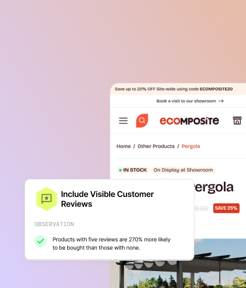
People aren’t necessarily looking for famous logos; they’re looking for reassurance that your product works. Notion achieves this through customer stories, usage statistics and recognisable brands, but the principle is much broader than that. Even if your company is relatively new, there are almost always stronger ways to communicate credibility than simply saying you’ve worked with a handful of clients. Perhaps your software has processed hundreds of thousands of transactions, automated thousands of hours of manual work or handled millions of API requests. Those kinds of statistics demonstrate real-world usage and help visitors feel more confident that they’re not taking a risk by trying your product. As an agency, this is something we often encourage SaaS businesses to think differently about. Sometimes the evidence is already there, it’s just being presented in the least compelling way possible.
Great websites answer objections before they’re raised
Every visitor arrives on your website carrying a list of questions, even if they don’t consciously realise it.
Will this integrate with the tools I already use? Is it difficult to set up? How quickly can my team learn it? Is this actually better than what we’re already doing? The best SaaS websites don’t wait until someone reaches the FAQ page to answer those concerns. They weave the answers naturally throughout the experience.
That’s another area where Notion performs exceptionally well. Instead of relying on static screenshots or long feature descriptions, it demonstrates functionality visually. Visitors can see how features behave, how workflows fit together and what the end result looks like. By the time someone reaches the bottom of the page, many of the doubts that would normally prevent a sign-up have already disappeared. Whenever you’re reviewing your own homepage, it’s worth asking yourself a different question. Rather than thinking about what you want to say, think about what your customers are worried about. Those are often two very different conversations.
Simplicity almost always converts better
One thing that’s easy to overlook about Notion’s website is how digestible it feels. There’s plenty of information on the page, but it never feels overwhelming because it’s broken into clear, focused sections. Each part of the homepage has a single purpose before smoothly leading into the next.
Compare that to many SaaS startups, where every feature, benefit and differentiator is squeezed onto the homepage in the hope that something will resonate. The result is usually the opposite. Visitors are presented with so much information that they don’t know where to focus. Good conversion-focused design isn’t about saying more. It’s about making the important things easier to find. That often means simplifying layouts, reducing unnecessary copy and giving each section enough breathing room to communicate a single message well. Visitors shouldn’t have to work to understand your product. The website should do the hard work for them.
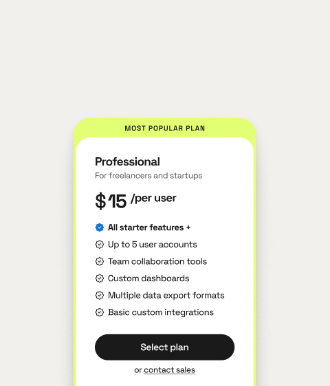
Pricing shouldn’t feel like a secret
If there’s one lesson I’d encourage every SaaS founder to take from Notion, it’s this: don’t make people work to understand your pricing.
Unless you’re selling highly bespoke enterprise software, hiding costs behind a contact form or mandatory demo usually creates more friction than value. Buyers want to know whether your product is realistically within budget before investing their time. Notion embraces transparency. Pricing is easy to find, easy to compare and supported by simple tools that help visitors understand exactly what they’ll pay. Even the way pricing tiers are presented makes comparisons straightforward, allowing users to make informed decisions without feeling overwhelmed.
The easier you make purchasing decisions, the more likely people are to make them.
Conversion optimisation is really about removing friction
When people analyse high-performing websites, they often look for one magic feature that explains why they convert so well. In reality, it’s almost never one thing.
It’s dozens of thoughtful decisions working together.
A download button that automatically detects your operating system. Sticky calls to action that remain visible as you scroll. FAQs presented in a way that doesn’t overwhelm the page. Clear routes to additional help if someone still has unanswered questions. Individually, none of these changes transform a website. Collectively, they create an experience where taking the next step feels easy. That’s ultimately what conversion optimisation is. Not persuading people to buy something they don’t want, but removing every unnecessary obstacle between interest and action.
Final thoughts
There isn’t a single design trick that will suddenly double your trial sign-ups or demo requests. The websites that consistently perform well do so because they’re relentlessly focused on making life easier for their users.
Notion is an excellent example of that philosophy in action, but the real takeaway isn’t to copy their homepage. It’s to start looking at your own website through the eyes of a prospective customer.
Can they understand your product within a few seconds? Do they have enough evidence to trust you? Is pricing easy to find? Have you answered the questions they’re likely to ask before they have to ask them?
If the answer to any of those is no, you’ve probably identified your next opportunity to improve conversions.
And the good news is that you don’t need a complete redesign to get there. Often, it’s a series of small, thoughtful improvements that have the biggest impact over time.
If you’d like an expert eye on your SaaS homepage, we’d be happy to take a look. Just hit the project planner button in the top right corner. Just hit the project planner book in the top right corner!