Understanding the Theory
The 5-Second Rule
As the name suggests, you have just 5 seconds to capture a user’s attention and convince them to stay on your site. These 5 seconds are crucial and at Strafe here is what we recommend you should focus on:
- Credibility and Trustworthiness: When users land on your site, it should immediately look credible. This means professional design, clear messaging, and elements that create trust. If a user doesn’t trust your site, they won’t stay long enough to explore further.
- Clarity: Your value proposition needs to be clear. Users should instantly understand what your service is and what it offers, If users have to spend more than a few seconds figuring out what you do, they’ll likely leave.
- Relevance: Your site should quickly communicate that your service is for the visitor. It should address their specific needs and problems. If your message is too broad, it may not resonate with anyone.
Turning away the wrong audience can be beneficial. For example, if your SaaS targets accountants, make it clear to deter irrelevant traffic. This precision helps attract the right audience, those who are more likely to convert.
Building Credibility
Credibility is key in those initial 5 seconds and here’s how to build it:
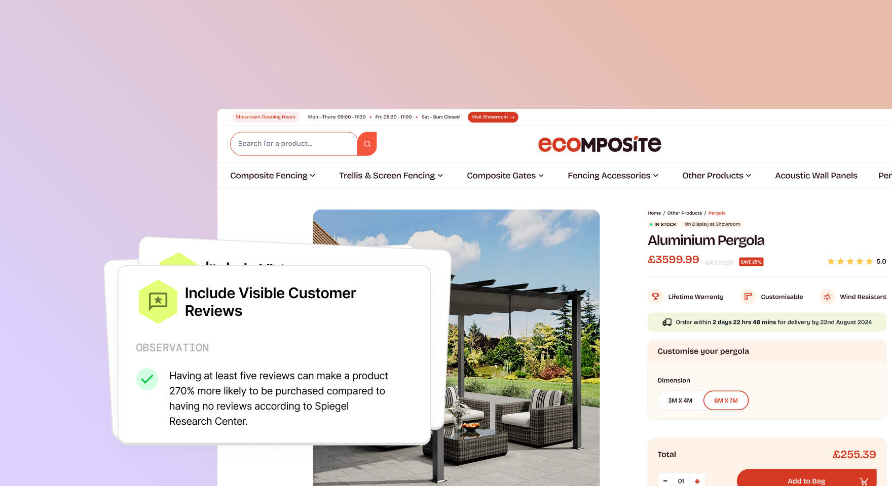
- Testimonials and Reviews: Display customer testimonials and reviews prominently. Positive feedback from real users can significantly enhance your site’s credibility. People trust people, and seeing that others have had a good experience can make a huge difference.
- Big Numbers: Showcase impressive stats like the number of clients served, total transactions, or any large-scale impact your service has had. For instance, if you run an email service and have only a few clients, highlight the volume of emails sent rather than the client count.
- Trust Signals: Use recognisable logos of your clients or awards won. Featuring logos of well-known brands that use your service can lend instant credibility. Additionally, any certifications or industry awards should be prominently displayed.
The KISS Principle
The KISS (Keep It Simple, Stupid) principle is important to consider. Don’t overcomplicate your content or design, keep the information straightforward and easy to digest. Your visitors should be able to determine if your service is right for them within seconds.
Here’s how to apply it:
- Simple Language: Avoid jargon and technical terms that might confuse visitors. Use plain language to explain what you do.
- Clear Visuals: Use clean and simple design elements. Avoid clutter and make sure your key messages are prominently displayed.
- Straightforward Navigation: Ensure your site is easy to navigate, users should be able to find what they’re looking for with minimal effort.
Examples
Example 1: Wax Wing

Wax Wing follows a traditional SaaS website style:
- White Space: Lots of negative space to avoid a cluttered look, this makes the site look clean and professional, which can create trust.
- Credibility Markers: Featuring recognisable logos and trust badges prominently. For example, Wax Wing prominently displays a badge from Product Hunt, a well-known platform in the SaaS space, to build credibility.
- Clear Messaging: Using a rotating ticker to personalise the message for different user segments. This dynamic approach helps communicate that the service is versatile and can cater to various needs.
- Contrasting CTAs: Highlighting the primary call-to-action (e.g., “Start Your Free Trial”) to draw attention. The CTA buttons use a contrasting colour to make them stand out against the rest of the page.
Wax Wing also uses animation to demonstrate their product and build credibility by showing logos of known clients. As you scroll down their homepage, you encounter a series of testimonials and case studies, further reinforcing trust.
Example 2: Cal

Cal adopts a minimalist black and white design, enhancing their credibility with colour pops like review stars and badges. Key features include:
- Clear, Simple Messaging: Instantly communicates what the service does. Their headline, “Scheduling infrastructure for everyone,” is straightforward and tells visitors exactly what they need to know.
- Trust Elements: Displays product ratings and recognisable logos to build trust quickly. Cal includes reviews from platforms like G2 and Google, complete with star ratings.
- Objection Handling: Addresses potential user concerns directly on the homepage with FAQs and use cases. This proactive approach can help ease any hesitations potential customers might have.
Cal’s site is designed to be user-friendly and visually appealing without being overwhelming. The use of black and white ensures that any pops of colour, such as review stars or CTAs, immediately draw the eye.
Applying Theory to Practice
To apply these principles to your own SaaS website, you should start by conducting an audit. Here are steps you can follow:
Review Your Homepage
Ensure it passes the 5-second rule. Is your value proposition clear? Does your site look credible and relevant?
- First Impressions: Test your site with new users who haven’t seen it before. Do they understand what your service does within 5 seconds?
- Visual Appeal: Make sure your design is clean and professional. This doesn’t mean it has to be fancy; it just needs to be clear and trustworthy.
Simplify Your Content
Apply the KISS principle. Remove any unnecessary jargon or complex descriptions.
- Edit Ruthlessly: Go through your site and remove any content that isn’t absolutely necessary. Every word should add value.
- User-Friendly Language: Write as if you’re explaining your service to someone who has never heard of it before. This ensures clarity.
Highlight Credibility
Add testimonials, reviews, and trust signals prominently.
- Gather Testimonials: If you don’t have testimonials, reach out to your current clients and ask for their feedback.
- Display Logos and Awards: Make sure any recognisable logos or awards are visible without scrolling.

Optimise Your CTAs
Make sure your primary CTAs stand out and are easy to find.
- Contrast and Position: Use colours that stand out from the rest of your site. Place your CTAs in logical spots where users are likely to look next.
- Action-Oriented Language: Use verbs and action phrases like “Get Started,” “Try for Free,” or “Sign Up Now.”

Actionable Steps to Improve Your SaaS Website
To implement these insights into your SaaS website, we recommend you follow these actionable steps:
1. Define Your Value Proposition Clearly
Ensure that anyone visiting your site can understand what you do within 5 seconds. Your headline should be concise and to the point.
2. Use Visual Hierarchy
Organise your content in a way that guides the visitor’s eyes through the most important elements first. Use larger fonts for headlines, contrasting colours for CTAs, and enough white space to avoid clutter.
3. Leverage Social Proof
Incorporate testimonials, reviews, and logos of well-known clients. Highlight any awards or recognitions your product has received.
4. Simplify Your Design
Adopt a minimalist design approach. Ensure your site is easy to navigate and that the information is digestible. Remember, less is more.
5. Focus on Speed
Page load speed is critical. If your site takes too long to load, visitors will leave before they even see your value proposition. Use tools like Google PageSpeed Insights to test and improve your site’s speed.
6. Test and Iterate
Continuously test different elements of your site, from headlines to CTAs. Use A/B testing to see what works best and iterate based on the results.
Conclusion
By understanding and applying the theory behind what makes a SaaS website effective and learning from the examples, you can improve your website’s conversion rates. Simplicity, clarity, and credibility are great things to focus on at a starting point.
Watch the full video using the link below:


