At Strafe Creative, we’ve worked with multiple SaaS companies over the years, helping them optimise their strategies to create high-converting pricing pages. This blog gives almost a checklist of items you should consider implementing to boost your conversion rates. You can watch the full video using the link at the bottom of this page.
Utilise Credibility
Clearly showing the companies that trust your product by using logos of your existing clients, especially if they are well-known brands. Even if you don’t have big names, you can still use the clients you do have to build trust. This gives reassurance for potential customers visiting your site.

Clear, Digestible Layout
Avoid cluttering your page with too much information and use a clean design. The Notion website is a good example, using white space to draw attention to key elements. Notion’s pricing page also uses clear sections with a big opening title and minimal text at the top, making it easy to digest.

Highlight the Best Option
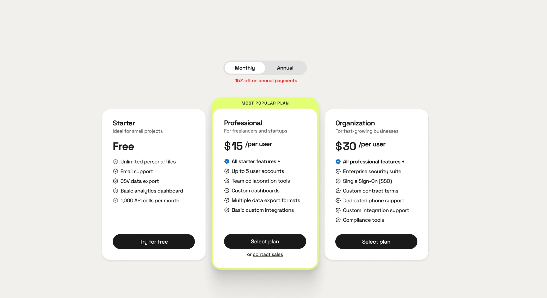
Use colour theory to draw attention to the pricing tier you want to promote, like Pipedrive and Notion do by using a contrasting button for their ‘Plus’ plan or a ‘Popular’ tag. Highlighting the most recommended or popular option helps guide users to a decision.

Easy Comparison
Make sure your pricing table is easy to read and break down features into digestible chunks with clear titles. Slack’s table is segmented with individual lines and tick items, making it simple to compare. You should avoid long, overwhelming lists where possible as this can be off-putting for users.

Interactive Tooltips
Include tooltips for more detailed explanations of features as this keeps your page clean while still providing necessary information for users who want it. Notion uses small tooltips to help users understand specific features without overcrowding the page.

Use Testimonials and Case Studies
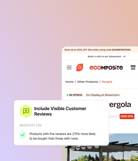
Testimonials are something we talk a lot about at Strafe because if done correctly they can be great for increasing your conversion rates. Placing your testimonials and case studies at strategic points on your page, is key because if a user has scrolled to the bottom without committing, these can provide the final push by building credibility and showcasing successful user stories.

FAQs
An FAQ section is a great feature to include as it saves space by hiding detailed answers behind clickable questions, keeping your page tidy. Additionally, tracking which FAQs are clicked most often can provide insights into common user concerns, allowing you to address these points clearly in your marketing.

Bonus Tip! Offer a Secondary Call-to-Action
For users not ready to commit, we recommend providing a secondary call-to-action, like setting up a demo or signing up for a free trial. This keeps them engaged with your product and moves them closer to conversion even if they aren’t ready to buy immediately.

Final Thoughts
By incorporating these strategies, you can significantly improve the effectiveness of your SaaS pricing page.
These tips aim to help create an engaging and user-friendly pricing page that highlights the value of your product and guides users towards making a purchase.
You can watch the full video here:


