Notion: Simplicity Meets Functionality
Notion, (I couldn’t not include this SAAS product right!?) stands out for its minimalist design, using a black and white theme to draw attention to key areas with strategic uses of colour. The purple button indicating an AI add-on and subtle colour highlights to signal interactive elements are prime examples of how Notion uses design to guide user attention effectively. Moreover, the immediate showcase of trusted brands like Nike, Pixar, and Uber lends substantial credibility, reassuring potential customers of Notion’s value. I’m aware of course that not everyone has those names to use, but there’s no reason we can’t be showing clients logos or even larger numbers such as “trust by XX number of companies” as a way to build credibility.

The clarity and digestibility of Notion’s pricing options are awesome. With clearly defined plans ranging from Free to Enterprise, users can easily navigate through their choices. The use of interactive tooltips for additional plan details enhances the user experience without cluttering the page. (Tbh this is something we’re going to start doing on our pricing pages more, I think this is great!)

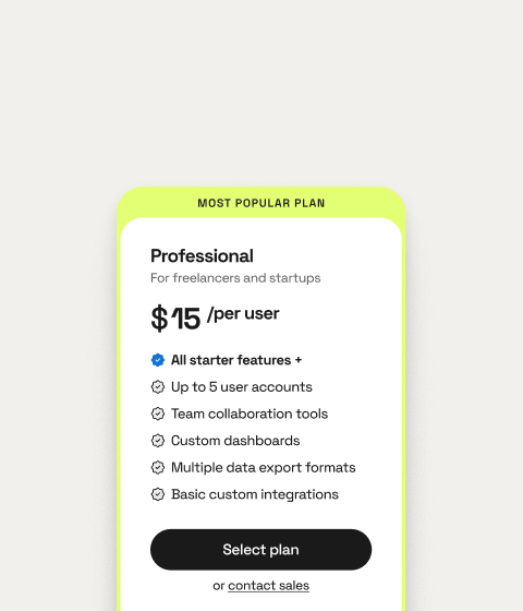
Highlighting the Plus plan as the most popular choice, with a distinct colour and tag, subtly influences user preference, demonstrating an effective way to nudge users towards a decision. Its the classic, if unsure go with the most popular idea.
Slack: Comprehensive Comparison and Subtlety
Slack’s pricing page, while following a structure similar to Notion with clear plan delineations, focuses more on comprehensive comparisons. Unlike Notion, Slack does not use colour as distinctly to guide user choices but instead emphasises a detailed comparison table. This approach helps users easily compare features across plans, making it straightforward to understand what each plan offers for the price. I would say I understand why they have to do this, visually its very cluttered compared to Notion.

One area where Slack excels is in the clarity of its comparison table, which becomes even more user-friendly with hover effects that highlight the selected plan. This feature addresses a common user pain point in pricing pages – difficulty in comparing plan features side by side. However, Slack’s page could benefit from more distinct calls to action and perhaps a more strategic use of colour or design elements to highlight recommended plans.

Before we move on
I do want to highlight that these next products I’ve never actually used and I do feel a little bit bad about talking about their issues, but for clarity I went to Product hunt and went to yesterdays leadership board and opened the options with the lowest Upvotes (upvotes are an indication of how popular the product is) I did this on the basis of: if the website doesn’t showcase the product well enough, people won’t sign up, if you don’t sign up they can’t upvote it!
Parallel AI: A Study in Confusion
Parallel AI’s approach is… ok…. But the design fails to differentiate significantly between individual and business plans, creating a confusing user experience. The presentation of pricing information lacks clarity, with similar-looking options that do not effectively communicate the value proposition of each plan. Moreover, the decision to list prices without clear per-user indications or minimum user requirements adds to the confusion, potentially leading to hesitation from potential customers. What I mean by this is, the Business user is cheaper than the individual option. Im guessing this is because for a business user you have a minimum number of users, but that isn’t highlighted so its confusing.

The lack of emphasis on any particular plan, combined with a cluttered layout, underscores the importance of simplicity and clarity in pricing page design. Parallel AI’s example highlights how confusion can be a major barrier to conversion, emphasising the need for SaaS platforms to present their pricing information as straightforwardly as possible.
Optify: Missing Opportunities for Engagement
Optify’s pricing page illustrates another common pitfall – lack of detailed information and engagement opportunities. The absence of a comprehensive comparison or additional details beyond the basics leaves users with more questions than answers. The minimalistic approach, while clean, fails to provide users with a compelling reason to choose one plan over another, especially when the free option appears to offer substantial value. For example, it says I get access to Access to all 4 optimizations and Batch processing but thats in all the options? I can only presume they want all users to start on the free option and upgrade from there?

The lack of FAQs, interactive elements, or clear calls to action at the bottom of the pricing page means Optify misses out on opportunities to engage with potential customers further and address their concerns. This example underscores the importance of not only presenting pricing information clearly but also using the pricing page as a tool to educate and reassure potential customers.
Conclusion: Best Practices for SaaS Pricing Pages
Creating an effective SaaS pricing page requires a delicate balance of design, information presentation, and user engagement. Notion and Slack demonstrate strong approaches with their focus on simplicity, clarity, and user guidance. Meanwhile, the challenges faced by Parallel AI and Optify highlight the importance of avoiding confusion and providing ample information to facilitate the decision-making process.
Successful SaaS pricing pages are those that consider the user’s perspective first and foremost, making it easy for them to understand, compare, and ultimately see the value in the offered plans.


