First Impressions and Homepage Insights
HubSpot’s homepage clearly shows smart design planning, the site greets visitors with a strong headline that immediately addresses what the user wants, which is growth. The use of contrast around the CTA (call-to-action) for getting a demo ensures it’s the focal point, cleverly guiding users towards taking action. This strategic placement is not by accident, it’s designed to engage the user and make the journey from visitor to lead as simple as possible.

Credibility as a Conversion Catalyst
Here at Strafe, we know the importance of trust and HubSpot invests in this wisely. By showing user statistics and a global footprint early on, it taps into the psychological principle of social proof. The inclusion of well-known company logos further creates credibility, putting the user at ease. For SaaS companies, this underlines the importance of using any form of social proof, from client logos to user testimonials, building trust from the beginning.

Making Services Easy to Find with Simple Navigation
HubSpot’s service offering is massive, yet they do a great job with their website to not overwhelm the user. This is achieved through a highly organised search bar that categorises services into digestible sections. The distinction between marketing, sales, and service hubs, guides users intuitively towards the information most relevant to them. This clarity in navigation is important for SaaS websites to consider, the goal is to create a user journey where they can find solutions to what they are looking for without any friction.

Addressing User Queries with Strategic Content Placement
At Strafe, we know how important understanding and quickly addressing user queries is. Hubspot shows a great example of this in their UX strategy. A well-placed video on the homepage clearly explains what HubSpot is, answering the user’s main questions in advance. This approach of strategically placing content to address user queries head-on, can significantly enhance user engagement and reduce bounce rates for SaaS platforms.

Interactive Pricing Pages: A Lesson in Clarity and Choice
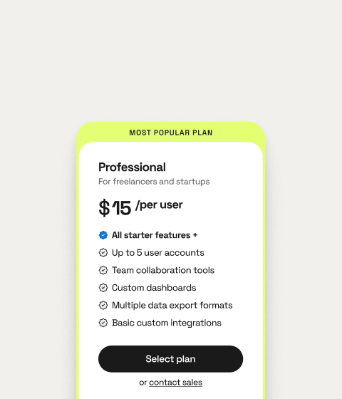
The pricing page often creates a challenge for SaaS companies, given the complexity of product offerings. HubSpot’s approach is to use interactive elements and clear comparisons to provide a more simple pricing structure. The ability to easily compare different plans side by side allows users to make informed decisions, reducing indecisiveness and encouraging conversions.

CTAs that Stand Out and the Importance of Contrast and Clarity
We talk about CTAs a lot here at Strafe and that is because if they are done correctly, they can be very powerful in boosting your conversion rates. HubSpot’s CTAs are designed to stand out, but with the site using orange for its CTAs, which, while attention-grabbing can sometimes blend with the other orange elements on the site.
Including the high-contrast mode on HubSpot’s website is a nod to accessibility and inclusivity, ensuring the website is easy to navigate and engaging for all users. This feature not only aids those with visual impairments but also emphasises the importance of designing for diverse user needs, a principle that can enhance user satisfaction and broaden a SaaS product’s appeal.
Introducing a new colour or modifying the design to make CTAs more prominent, can significantly impact user action. This highlights an important consideration for SaaS companies, which is the need for CTAs to not only be clear in messaging but also in how they look.

Educational Resources as Conversion Tools
HubSpot excels in offering value beyond its core services through plenty of educational resources. By providing blogs, guides, and courses, HubSpot not only positions itself as a thought leader, but also builds a connection with its audience. SaaS companies can use this strategy by offering valuable content that addresses their audience’s pain points and interests, creating a community and encouraging user loyalty.

Continuous Improvement through User Feedback
At Strafe, we think one of HubSpot’s main strengths lies in its commitment to continuous improvement, informed by user feedback and behaviour. This repetitive approach to UX/UI design ensures that the platform continues to improve in alignment with user needs, promoting long-term user engagement and satisfaction.
SaaS companies can adopt a similar approach, prioritising user feedback as a foundation of their design process to stay relevant and competitive.

Final Thoughts Around Building Websites for Users
HubSpot’s website is a hub for increasing conversions driven by smart UX/UI design. Establishing trust through social proof to simplifying navigation and clear pricing, each element of HubSpot’s design is made with the user’s journey at the forefront. SaaS companies looking to boost their user base should focus on creating user-centric websites that not only attract visitors but convert them into loyal customers.
Through attention to detail, a commitment to addressing user needs and a strategic approach to content placement and interactive design, SaaS platforms can enhance their user experience, boosting conversions and driving business growth. Strong UX/UI design is a must-have for achieving and sustaining success in the world of SaaS.


