Understanding User Concerns
Before getting into the redesign, it is important to identify the main concerns users might have. When we are considering buying a product, we have lots of questions such as a product’s durability, ease of use, and compatibility with our existing needs.
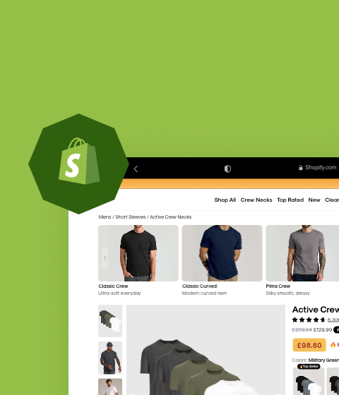
Taking a simple product like a T-shirt, a typical e-commerce landing page would list the size, colour options, reviews, price, and some images. However, if you think about your customers potential needs and concerns, you can provide more subtle but key information. For example, is the T-shirt gift-worthy? How durable is it? Can it be tumble dried? These are the kinds of questions that good e-commerce pages should anticipate and answer.
A Case Study – Transforming a Gaming Chair Landing Page
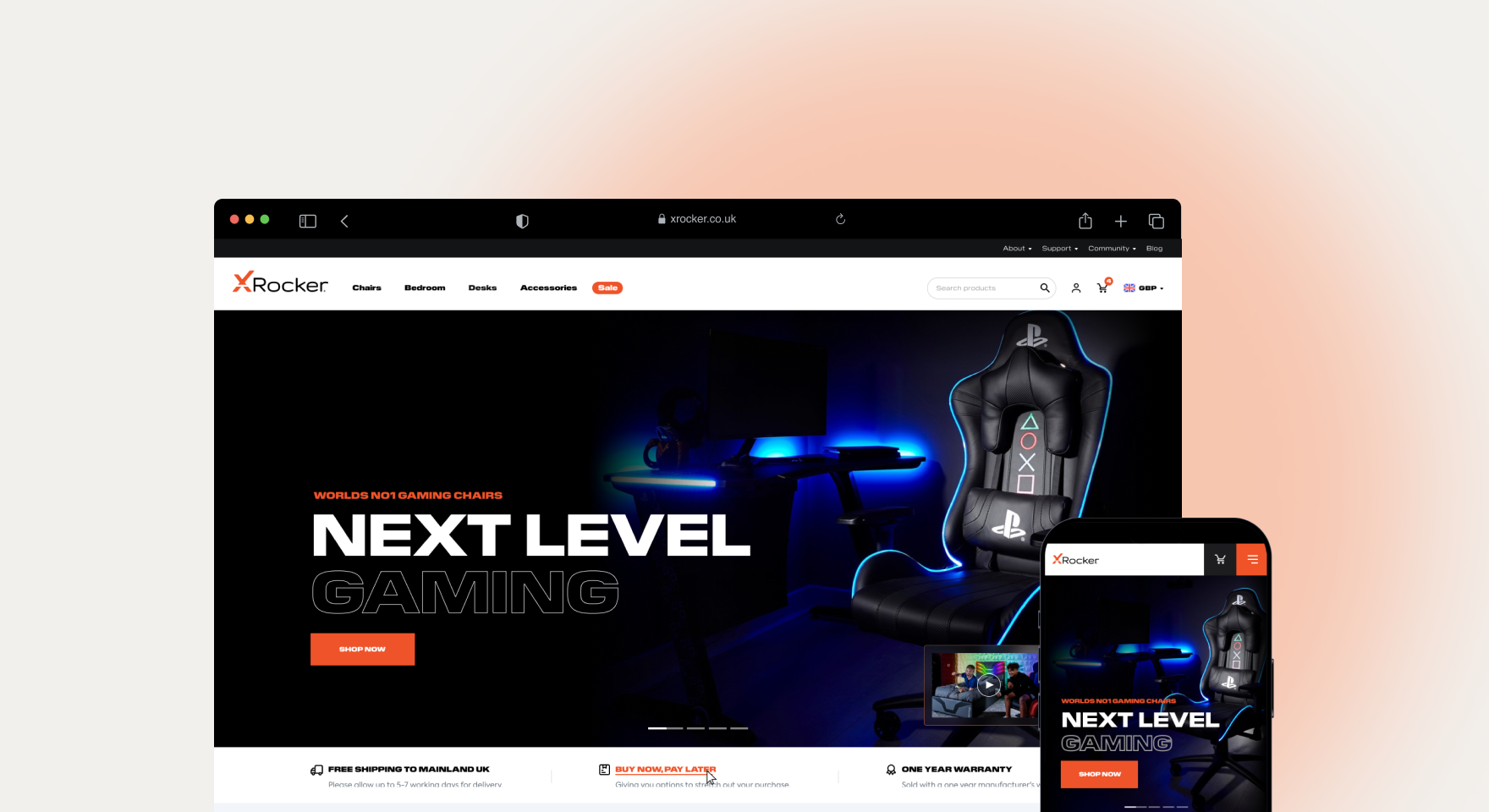
Our client, a gaming furniture company, wanted to improve their conversion rates. We focused on one of their best-sellers, a gaming chair and redesigned its landing page to address potential buyer concerns more effectively.
Key Strategies Implemented
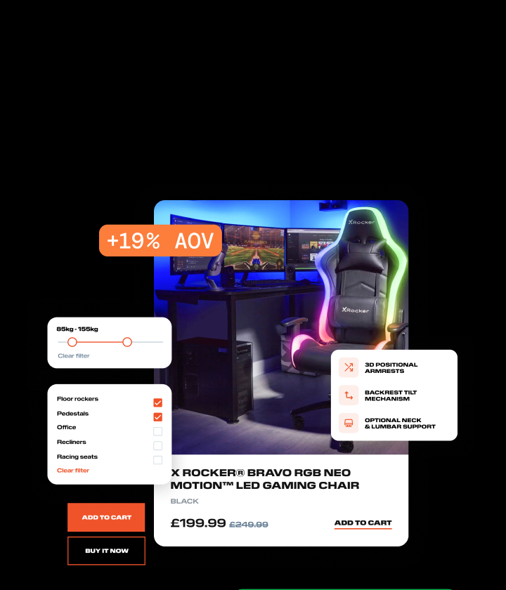
- Highlighting Key Features and Benefits: We used icons and brief descriptions to make it clear how adjustable and comfortable the chair is. Features like a tilting backrest, multi-directional armrests, and material quality were prominently displayed. This approach ensures that users can quickly see the chair’s benefits without being overwhelmed by text.
- Strong Imagery: High-quality images and videos were used to show the chair in different settings and from various angles. This included lifestyle shots and close-ups of important features, providing a better sense of the product’s use and appeal. Good photography can significantly impact a customer’s perception and can be the deciding factor in making a purchase.
- Customer Reviews and Social Proofing: Reviews were placed near the top of the page, ensuring users saw them early in their browsing experience. This builds credibility and trust from the outset. Potential customers are heavily influenced by the opinions of others, and showcasing positive reviews can mitigate doubts about product quality and reliability.
- Interactive Elements: We incorporated interactive elements like parallax scrolling, where the imagery and text moved at different speeds, keeping the call-to-action button constantly visible. This design choice ensured that users always had the option to purchase in sight. Interactivity not only makes the page more engaging but also helps keep the user’s attention focused on the key action we want them to take.
- Detailed Specifications: Detailed specifications were provided, including dimensions, weight capacity, and material types, addressing any potential technical queries a user might have. This information was organised in a way that was easy to scan, ensuring users could find what they needed without sifting through paragraphs of text.
- Clear Call to Actions (CTAs): Split testing helped determine that “Add to Cart” should be more prominent than “Buy Now” to encourage users to consider adding more items to their purchase. The position, colour, and wording of CTAs were optimised to stand out without being overly aggressive. The right CTA can make a significant difference in conversion rates.
- Comprehensive FAQ Section: An FAQ section was included to preemptively answer questions about delivery times, return policies, and assembly instructions. FAQs help to provide instant answers to common questions, which can prevent users from abandoning their purchase due to unresolved doubts.

A Step-by-Step Breakdown of Our Process
Initial Research and Planning
The first phase involved comprehensive research to understand the target audience’s needs, preferences, and potential objections, this included:
- User Surveys and Interviews: We gathered feedback directly from users to understand their pain points and what they looked for in a gaming chair.
- Competitor Analysis: Studying competitors helped identify industry standards and opportunities for differentiation.
- Market Trends: We looked at broader market trends in gaming furniture to ensure the landing page would appeal to current demands.
Design and Content Strategy
Once we had this information, we moved on to designing the landing page, the key components included:
- Wireframing: Initial wireframes were created to outline the structure of the landing page, ensuring a logical flow of information.
- Visual Design: High-quality designs incorporating brand colours, typography, and imagery were used to create a consistent look that aligns with the brand’s identity.
- Content Creation: Copy was crafted to be clear, concise, and persuasive, highlighting the product’s unique selling points.
Development and Implementation
Once the design was finalised, the next step was to bring it to life!
- Front-End Development: Our developers translated the design into a responsive, interactive webpage, ensuring it worked seamlessly across devices.
- Back-End Integration: The landing page was integrated with the client’s e-commerce platform, enabling smooth transactions and data tracking.
Testing and Optimisation
After we launched, continuous testing and optimisation was crucial to maximise performance:
- A/B Testing: Different versions of the landing page were tested to see which elements performed best.
- Analytics Tracking: Tools like Google Analytics were used to monitor user behaviour and identify areas for improvement.
- User Feedback: Post-launch feedback was collected to make further refinements.
Results and Analysis
The redesigned landing page delivered impressive results:
- 79% Increase in Conversion Rate: More visitors were turning into customers, thanks to the optimised layout and persuasive content.
- 13% Increase in Average Order Value: Customers were spending more per transaction, likely influenced by the enhanced product presentation and effective upselling techniques.
Lessons Learned and Future Strategies
Key Takeaways
- Understand Your Audience: Thorough research is the foundation of any successful landing page. Knowing your audience’s concerns and preferences allows you to address them effectively.
- Visual Appeal Matters: High-quality visuals can significantly enhance the perceived value of your product.
- Clear and Concise Information: Providing detailed yet easily digestible information helps build trust and reduces purchase hesitations.
- Continuous Improvement: Regular testing and feedback loops are essential to maintain and improve landing page performance.
Future Enhancements
Based on our findings, future strategies may include:
- Personalisation: Tailoring the landing page experience based on user data to offer more relevant content and product recommendations.
- Advanced Analytics: Using more sophisticated analytics tools to gain deeper insights into user behaviour
- Interactive Features: Adding more interactive elements, such as 3D product views or augmented reality features, to further engage users.
Conclusion
A well-constructed ecommerce landing page should look to anticipate and address user concerns, provide lots of visual and textual information, and guide the user towards making a purchase. By implementing these strategies, you can significantly improve your landing page’s effectiveness and boost your conversion rates.
Watch the full video using the link below:


