Analysing the Mobile Experience
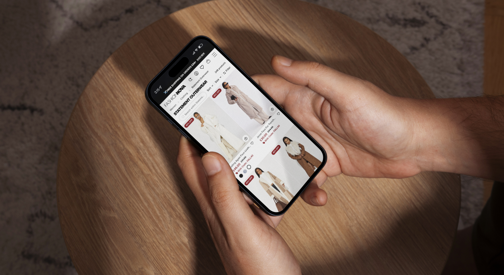
We began by looking at the mobile version of the Fashion Nova website, which felt optimised for mobile users, likely because much of their traffic comes from their social media. The mobile experience is fairly strong but we did see areas for improvement. One noticeable issue was that the site felt busy at times with lots of different elements, this can be problematic because when you have multiple elements competing to stand out, it becomes challenging for users to focus on any single aspect.
We noticed at the top of the page, there is a “hello bar” above the main menu. This bar, along with the main menu and a secondary menu for additional options, takes up a significant amount of real estate (we estimated around 20-25% of the page!). This can be overwhelming for users and we feel a more streamlined approach would enhance the user experience by making navigation simpler and more intuitive.

Simplifying the Colour Hierarchy
At Strafe, we talk about colour hierarchy a lot because if done correctly it can significantly help increase conversion rates. The colour hierarchy on the Fashion Nova website again felt busy, the use of a very vibrant red to draw attention to specific elements, while effective in catching your attention, feels overwhelming at times. While we can see that the red might align with the brand’s aesthetic and the relatively low price points of the products, a more strategic approach would be more effective when trying to draw users attention to certain products.
Homepage Analysis
The homepage does a great job of offering users different options right from the start. Users can click into specific categories, take advantage of a sale, or get inspiration from featured products. This approach appeals to different user intents and can help guide them to their desired sections quickly. Additionally, the infinite scroll feature at the bottom of each page allows users to continue browsing easily, keeping them engaged for longer.
Individual Product Pages
We then moved onto the product pages, where we saw a contrast from the busy homepage. Fashion Nova creates a clean and straightforward layout with a simple menu, allowing the product images to take stand out. The image design encourages users to swipe across images which are both user-friendly and visually appealing for the target demographic.
However, we did find some areas for improvement. The product page lacked detailed information about the fabric, washing instructions, and fit, which are key for online shoppers. Adding these details addresses potential objections and reduces the likelihood of returns. Including information about the model, such as height, size, and the actual size they are wearing, can also help users make more informed purchasing decisions, allowing them to visualise how the product might fit on them which is really important.
Enhancing the Reviews Section
The reviews section was another strong point in our opinion on the product pages. Highlighting the rating and incorporating an “overall fit” feature helps users understand if products are true to size. Reviews that give detailed information like this are very helpful for users looking to buy items whilst building trust across your website.

Sticky Call-to-Action (CTA) Button
At Strafe, we love CTAs as they are key to boosting conversion rates. One particularly effective feature is the sticky call-to-action (CTA) button. As users scroll down the page, a CTA button with the product image, title, price, and an “add to bag” option appears at the top of the screen. This feature keeps the purchase option visible at all times, reducing the friction in the buying process. Testing the placement of a sticky CTA, whether at the top or bottom of the screen, can help to optimise user interaction and conversion rates.

Upsell Features
Upsell features are a great way to encourage users to purchase particular products or offers. When adding an item to the bag on Fashion Nova’s website, it offers an upsell feature, suggesting additional items that can increase the average order value. This feature is well-integrated into the mobile experience and encourages users to consider complementary products. The shopping cart also highlighted free shipping if you spend a certain amount, incentivising users to add more items to their cart.

Desktop Experience
Moving onto the desktop version, we analysed how users navigate a site through a menu system, search, or simply scroll through the page. While the mobile version was fairly streamlined, the desktop version felt more cluttered. The menu was a little overwhelming due to the number of products. Introducing subtle variations in colour or spacing within the menu we felt would improve readability and user navigation.
Improving the Search Function
The search function on the desktop version was another area we highlighted. Given that many users prefer searching for specific items, making the search bar clearer and more user-friendly could help to improve the overall user experience. Improving the search results with better categorisation and filtering options could also help users find what they are looking for more efficiently.

Simplifying the Homepage
Overall, we felt the desktop version’s homepage was functional but could benefit from a cleaner design with more negative space to make it easier for users to focus on key elements without feeling overwhelmed. Simplifying the main menu on the cart page for example by removing unnecessary elements, could help keep users focused on completing their purchase and not get distracted.
Checkout Flow Optimisation
Finally we analysed the checkout flow on both mobile and desktop as this is key for conversion rates. Fashion Nova uses Shopify, which offers a streamlined and familiar checkout process. However, there are still opportunities for optimisation, such as personalising the checkout page with the brand’s fonts and colours to create a better user experience. Additionally, making sure that all necessary fields are easy to navigate on mobile devices can reduce cart abandonment rates.
Conclusion
In summary, while Fashion Nova’s website offers a strong foundation, there are several areas where improvements can be made to increase conversion rates and average order value;
- Simplifying the navigation, especially on mobile, can reduce user confusion and make the shopping experience more enjoyable.
- Providing detailed product information and context about the models can help users make more informed decisions, reducing the likelihood of returns.
- Enhancing the reviews section and incorporating sticky CTA buttons can keep users engaged and encourage purchases.
On the desktop version, improving the readability of the menu and making the search function more prominent can help users navigate the site more efficiently.
Simplifying the cart page and ensuring that the checkout process is smooth on both mobile and desktop will help reduce friction and improve conversion rates.
At Strafe, we think by addressing these areas, fashion e-commerce brands can create a more user-friendly and efficient shopping experience, ultimately leading to higher conversion rates and increased average order values.
Watch the full video using the link below:


