Fashion Product Page – Oh Polly

The first product page we looked at was ‘Oh Polly’, a standout example in the fashion industry. Right at the top, they feature vibrant imagery which we know is essential for visually-driven purchases. The ability to click and enlarge images, combined with a gallery mode for easy navigation, enhances the user experience.
Key Features:
- Breadcrumb System: Located at the top for easy navigation and improving SEO.
- Price and Reviews: Displayed prominently, again at the top with clickable reviews for more context.
- Colour and Size Options: Users can switch between different colours and sizes, with out-of-stock sizes offering an email notification option.
- Model Information: Providing model details (height and size) helps customers visualise the product on themselves.
- Size Guide: An interactive size guide personalises the shopping experience.
Oh Polly’s page also cleverly uses a muted pink as the brand colour, ensuring that the black “Add to Bag” button stands out. They highlight key information in bold and provide detailed product descriptions, including practical wear tips – this attention to detail reassures potential buyers, addressing their concerns before they even arise.
The inclusion of a “What’s my size?” feature is particularly useful too as shoppers can input their measurements to receive personalised size recommendations, reducing the likelihood of returns due to size issues. This feature, combined with the model information, creates a more immersive shopping experience, allowing customers to feel more confident in their purchase decisions.
Oh Polly also does a really good job in displaying their reviews. By making reviews clickable, users can read detailed feedback from other buyers, providing social proof and increasing trust. The visual representation of reviews, showing whether the product is too small, too big, or is true to size, is an excellent way to convey information quickly and effectively.
Fashion Product Page – True Classic

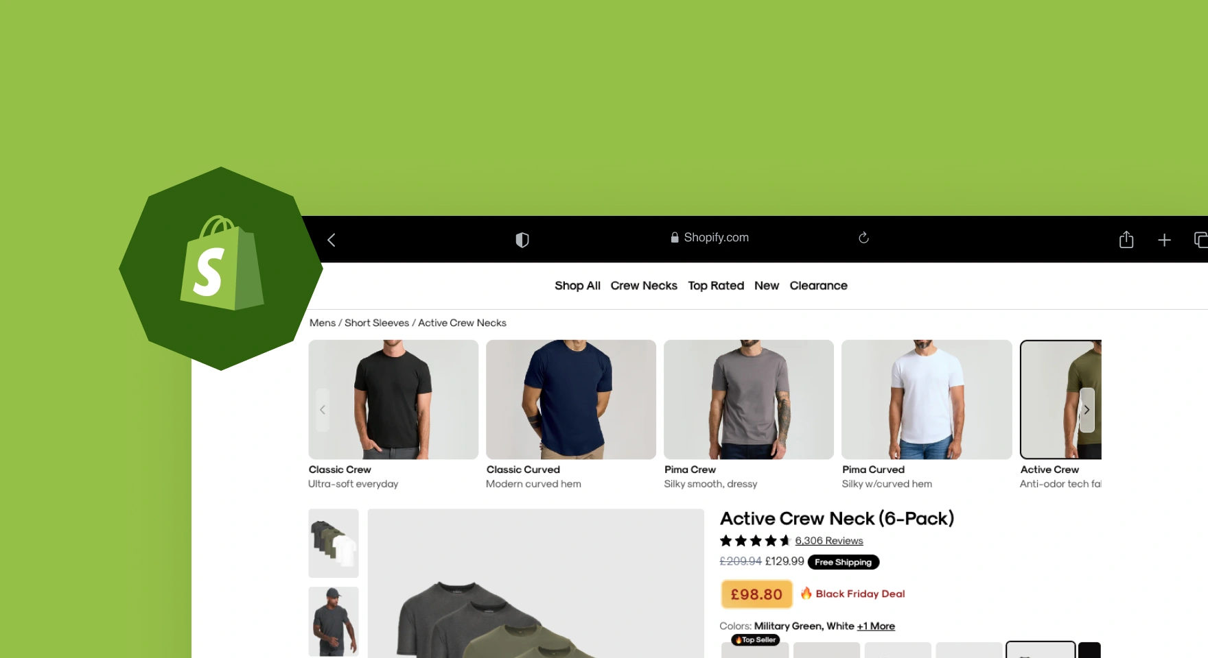
Next up, we looked at ‘True Classic’, another fashion brand but with a different approach. Their page focuses heavily on the fit of their t-shirts, featuring a range of models to show how the product looks on different body types.
Key Features:
- Large, Clickable Images: Allowing users to zoom in for a closer look.
- Model Variations: Showcasing different body types to emphasise the fit.
- Find Your Fit System: A third-party plugin that helps users find the right size.
- Credibility Builders: Positioned near the “Add to Cart” button, highlighting payment options and trust signals.
- User Reviews: Using both textual reviews and visual fit indicators to build trust.
True Classic uses high-quality imagery that takes up a large portion of the page, ensuring that users can see the product in detail. The variation in models, shows the t-shirt on both different body types, helping customers visualise how the t-shirt might look on them, addressing concerns about fit and appearance.
Their “Find Your Fit” system is another standout feature, this tool allows users to input their measurements and preferences, providing a tailored size recommendation. It’s a simple yet effective way to enhance the shopping experience and reduce returns. By integrating third-party plugins, True Classic ensures this feature is accurate and user-friendly.
Positioning credibility builders, such as accepted payment methods and trust badges, right below the “Add to Cart” button is cleverly done. It reassures customers about the security of their purchase, reducing friction at the critical point of conversion. Additionally, the site uses visual snippets from their TikTok adverts, repurposing existing content to engage and inform users.
True Classic also provides a detailed product description, highlighting the fabric composition, potential shrinkage, and their 100-day “Made to Last” guarantee. This transparency builds trust and addresses potential objections, such as concerns about the product shrinking after washing.

Gadgets Product Page – Firebox

Our next website was Firebox, known for its quirky and personalised products. Despite the novelty of their items, the product page remains clean and user-friendly which is great to see!
Key Features:
- Clean Design: Lots of white space to avoid clutter.
- Personalisation Options: Users can customise text and see real-time previews.
- Credibility Indicators: Displaying the number of items sold and overall ratings to build trust.
- Transparent Reviews: Accessible and readable reviews to enhance transparency.
Firebox’s product pages are designed with simplicity in mind, the extensive use of white space ensures that the page doesn’t feel cluttered, allowing the key elements to stand out. Personalisation options are front and centre, enabling users to customise products with text and see real-time previews. This interactive feature enhances user engagement and satisfaction.
Even if a product doesn’t have a large number of reviews, Firebox uses other credibility indicators, such as the total number of items sold. For example, a product might show 32 reviews with a 5-star rating and a note that 30,000 people have purchased it. This approach builds trust by highlighting the product’s popularity, even if detailed reviews are limited.
The site also features a bar at the top of the page with essential information like free delivery and returns, current discounts, and overall ratings. This non-intrusive banner ensures that users are aware of these benefits without overwhelming them. Additionally, the site uses contrasting colours for the “Add to Basket” button, making it easy to spot and click.
Transparency is key for Firebox, by making reviews easily accessible and displaying detailed product information, they create a trustworthy shopping space. This transparency extends to their payment options and delivery times, further enhancing customer confidence.
Skincare Product Page – The Ordinary

Moving onto skincare, ‘The Ordinary’ sets the benchmark with its minimalist and informative product pages. This brand’s reputation for transparency is reflected in its design.
Key Features:
- Minimalist Design: Focused on white space and clean lines to highlight product details.
- Detailed Usage Instructions: Clear information on how and when to use the product.
- Ingredient Transparency: Full ingredient lists and benefits prominently displayed.
- Educational Content: Videos and detailed descriptions to educate customers.
The Ordinary’s product pages are a masterclass in minimalist design, by using white space, they ensure that the focus remains on the product and its benefits. Each product page features detailed usage instructions, explaining how and when to use the product for best results. This level of detail is particularly important for skincare products, where the correct usage can significantly impact efficacy.
Each product page includes a full ingredient list, along with the benefits of each ingredient. This transparency helps build trust with customers, who can see exactly what they’re putting on their skin.
Educational content is another strong point we noticed here at Strafe. The Ordinary uses videos and detailed descriptions to explain the science behind their products, helping customers understand why a product might be right for them. This approach not only educates but also builds credibility and trust.
The site also features clear, high-quality imagery and videos showing the product in use. This visual content helps customers understand the texture and application of the product, making it easier for them to decide whether it’s suitable for their needs.
Furniture Product Page – X-Rocker

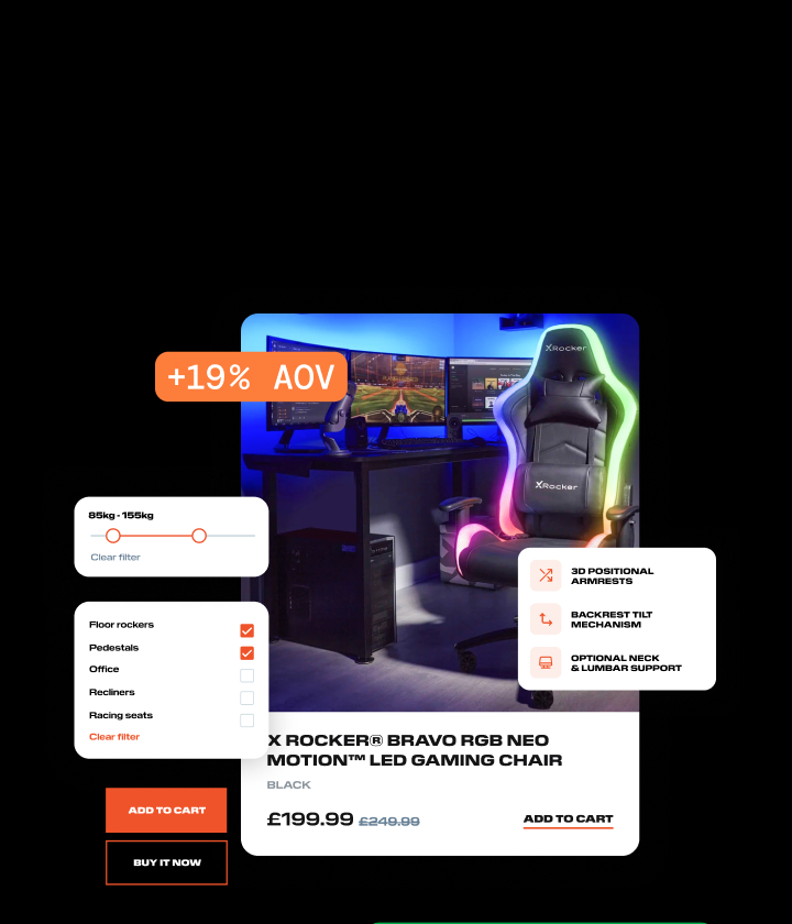
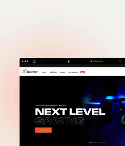
Finally, we look at X Rocker, a gaming chair brand that excels in showcasing its furniture’s features and benefits.
Key Features:
- Detailed Menu System: Allowing easy navigation to various sections like reviews and specifications.
- Parallax Scrolling: Engaging design that keeps the “Add to Cart” button visible at all times.
- Comprehensive Information: Ergonomic details, size dimensions, and user reviews all easily accessible.
- Colour Contrast: Strategic use of brand colours to highlight important information and CTAs.
X Rocker’s product pages are designed to be both visually appealing and highly functional. The detailed menu system at the top allows users to navigate to different sections of the page with ease, ensuring that they can quickly find the information they need.
One of the standout features is the use of parallax scrolling, is that this design technique creates an engaging experience by moving different elements of the page at varying speeds. It also ensures that the “Add to Cart” button remains visible at all times, making it easy for users to make a purchase without having to scroll back up.
The product pages provide comprehensive information, including ergonomic details, size dimensions, and user reviews. This level of detail is key for furniture purchases, where customers need to be sure that the product will fit their space and meet their needs. By including this information prominently on the page, X Rocker helps to address any potential concerns and facilitate the buying decision.
Colour contrast is used strategically to highlight important information and calls to action. The brand’s orange colour is used sparingly but effectively, ensuring that key elements like the “Add to Cart” button stand out.
Conclusion
These five Shopify product pages demonstrate how thoughtful design and user-centric features can drive conversions. By incorporating elements like high-quality imagery, clear sizing guides, credibility builders, and detailed product information, you can enhance your own product pages and boost your e-commerce success. Remember, small tweaks can lead to significant improvements in your conversion rates, so, take inspiration from these examples and start optimising your product!
Watch the full video using the link below:


