Intelligent Play offers a smart system to help ground staff and managers maintain their pitches to the highest standards. Sensors on the pitch track hundreds of data points which can then be used to optimise fields for player safety, pitch longevity and maximum performance.
We worked closely with the team to redesign the user dashboard to be more aesthetically pleasing. The goal was to ensure that all the data was useful and easily understood by anyone logging in.
Multiple personas to cater for
Clients of Intelligent Play include legendary football clubs, small sports centres and nationwide sports facilities. Each location has a varying number of pitches and a range of different users who require reports and data points.
We needed to design an intuitive user experience so managers or ground staff can find what they were looking for straight away.

The Data Dashboard
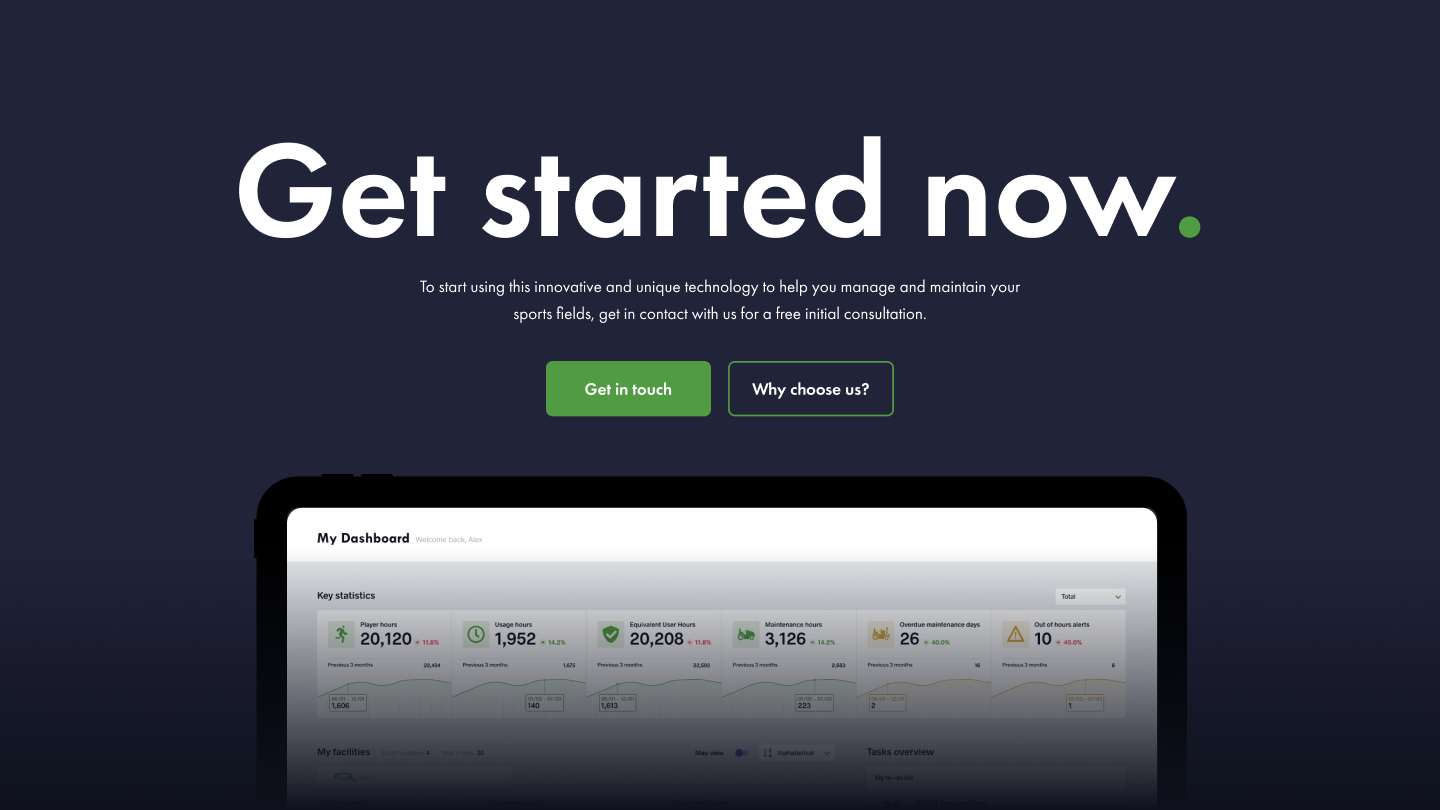
The comprehensive dashboard offers hundreds of data points, visuals and live views to help users make informed decisions and plans. Each data point it pulled in from the onsite pitch sensors and it was our job to make it visually appealing and easy to understand.
First look at the stats: After logging in, users are shown the overview dashboard which shows the key stats from across their grounds and pitches, a list/map of all the locations, plus a handy to-do list of tasks assigned to that particular user. Easily access notifications and your profile from the nav bar.
On the left-hand side, users can navigate between facilities to review specific information about each. The overview offers similar data to the homepage, plus a colour-coded guide to the status of each field – you can see at a glance which pitch needs attention!
Digging deeper into the data: by clicking into each field either by the status button or via the navigation bar users can really dig into the data. Review live visuals or heatmaps of the pitch, giving you a detailed insight into the state of the turf. The maintenance tab offers a slider heatmap, so you can review improvements across the pitch following maintenance. A small calendar shows scheduled and overdue maintenance for that specific pitch.
Some like it hot: a great addition to the user experience was the inclusion of weather data in each location, featured across the calendar widgets and on the usage charts. This is useful for planning maintenance work and reviewing how the weather affects the state of the pitch after use.


The Design Handover Process
For this particular client, we only worked on the designs and not the development as the team had these skills in-house. When working on a design-only project we have to plan and consider the handover to the client-side developers very early on. We never send files over and leave the client team to just get on with it.
To ensure a smooth transition between our design team and the in-house developers, we bring them into the project early on. This means we can work together on which design grid to use, check in on their capabilities and take that into consideration within the designs. For example, there’s no point in us wasting time designing a section the team don’t have the API for.
One example of this was the addition of weather data across the platform. In an ideal world, the weather API would pull in the data across all sorts of modules within the dashboard. However, with many people using the tech simultaneously, constantly refreshing and storing the data we concluded that it would likely slow the whole platform down. With this in mind, we included the weather in just one module.
This was an exciting opportunity to develop full user flows, wireframes, prototypes and designs for this highly detailed and interactive SaaS product, now with an improved user experience.


Et fin.👌


